Dimensions
7x34
Strings
14
Colors
4
Rate Pattern
11 Similar patterns
1 Photo
4 Comments
| You have to be Logged in to post a comment. |
| CraneWing |
3 years, 1 month ago by CraneWing
@LoopyCat Lol, even silly teachers'/pediatricians' posters can manage to pull off the bright color schemes if there's good, intentional design to them 😜 (and they didn't crowd every single wall of the room, all at once. 🙃😖 )Thanks again for your kind words! I really appreciate it and I'm glad you liked my work 😄 ❤️ |
| LoopyCat |
3 years, 1 month ago by LoopyCat
@CraneWing Yep I know what you mean; the boldly saturated, bright colors -- especially primary colors -- when used in the context of a design that isn't well-suited for "loud" colors, can end up making a bracelet look... well... dare I say, gaudy... or overly childish/juvenile... as if it belongs on the wall of a nursery school classroom or a pediatrician's office. Haha! 🤪 😂 But kudos to you for avoiding such pitfalls and instead creating something really beautiful for any age or taste! 👍 😎
|
| CraneWing |
3 years, 1 month ago by CraneWing
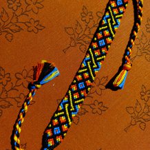
@LoopyCat Thank you!! ❤️ 😊 I had a lot of skeins for the orange, blue, and yellow I used here. Personally, I find them hard to use because of how saturated the colors are - especially the orange and yellow. So I thought "bold colors must call for bold designs" and this pattern was great for that! 😉👍
|
| LoopyCat |
3 years, 1 month ago by LoopyCat
@CraneWing WOW!! What a stunningly beautiful bracelet! Your colors pop out so brilliantly -- I'm seriously loving it! Thank you for sharing! 😎 😍 ❤️
|


